
KWZ inks are generally richly coloured and well behaved. Made in Poland by Konrad Żurawski there are Standard inks and Iron Gall inks. Within the second category is an "IGL” which is Iron Gall Light. Iron Gall Light still offers the hue change and water resistant qualities, at lesser intensities but with the pen care responsibilities of a standard ink. KWZ Aztec Gold IGL is one of those inks.
Thanks to Bookbinders Design Australia for sending this ink for review. Use code BBDMACCHIATO for 15% off!
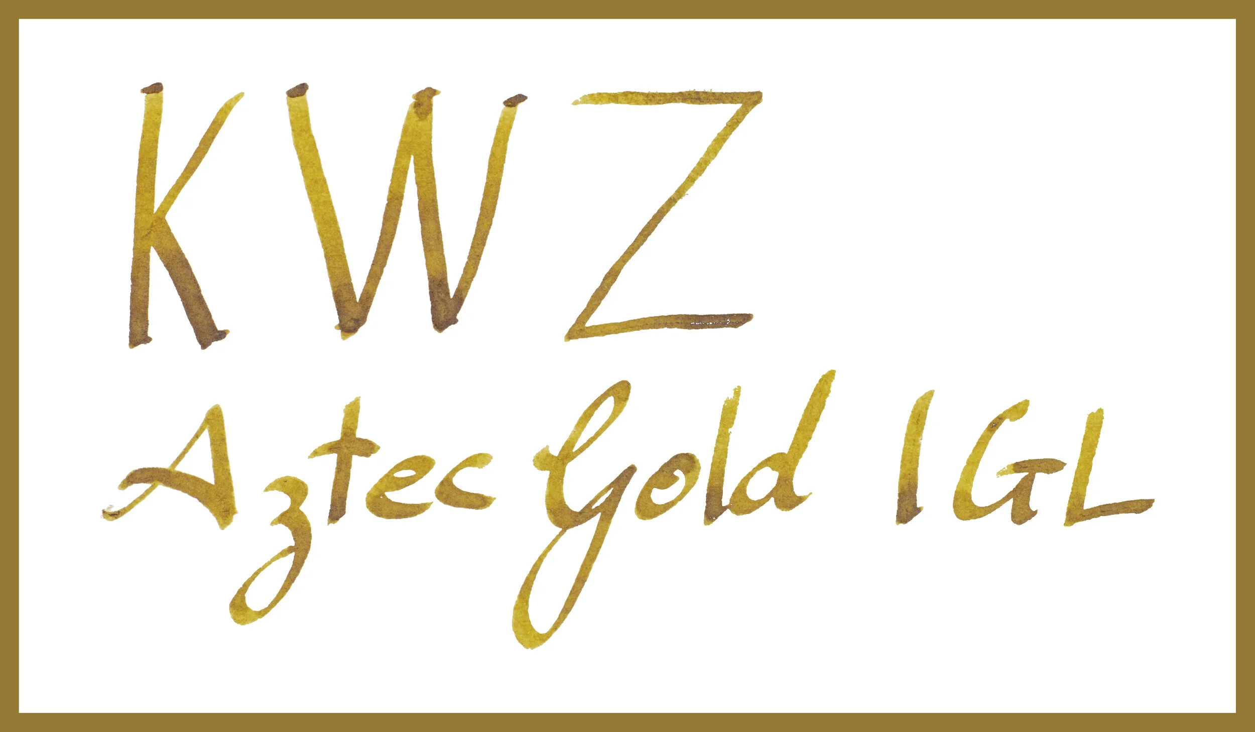
KWZ Aztec Gold IGL is a green tinted yellow that sometimes leans brown; an olive-green like yellow. The ink is generally well saturated but while rich it isn’t a high saturation colour and the ink also has a moderate luminosity being that it isn’t a pale ink but it isn’t dark either. The more concentrated the ink the darker (obviously) but also the browner the ink gets. As is common with Iron Gall inks the hue changes as it dries. When wet, Aztec Gold IGL has much less green in it.
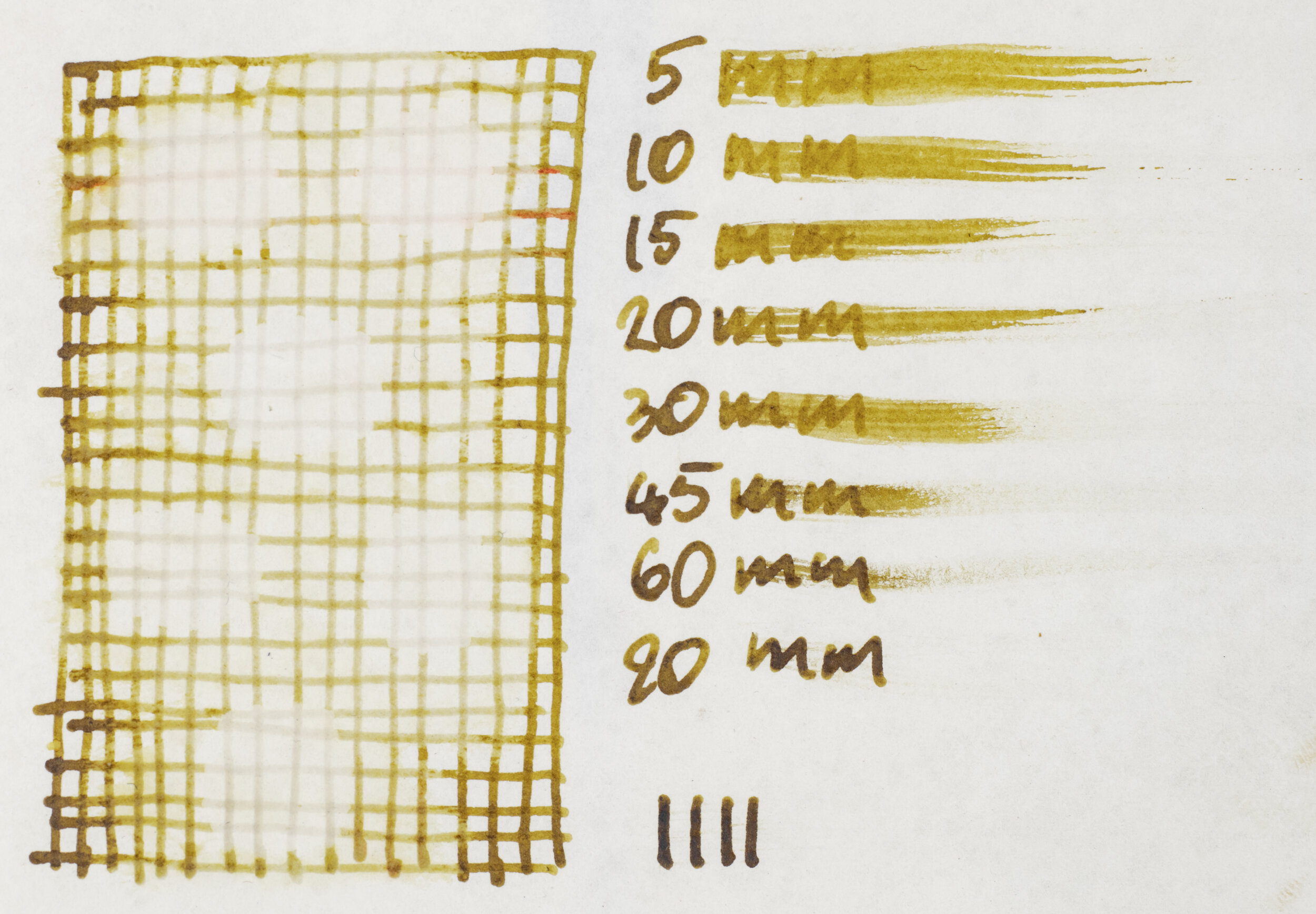
The ink is quite wet and lubricated and feels very pleasant and smooth to write with. On fountain pen friendly paper the ink performs very well but even on typically unfriendly paper the ink still performs above expectations. There is some spreading and the colour becomes a little flat but pretty decent over all. The colour remains fairly consistent throughout the paper types except, as mentioned, on poorer quality paper. Examples of the ink on 16 different paper types is at the end of the review.
The ink bottle is KWZ’s typical glass pill bottle like bottle with a black cap and a slimmer proportion compared to their older bottles which also had a white cap. The bottle glass is dark and you can’t see the ink colour apart from the label with it’s hand written ink name and ink swatch (always a nice touch with KWZ Ink bottles)!
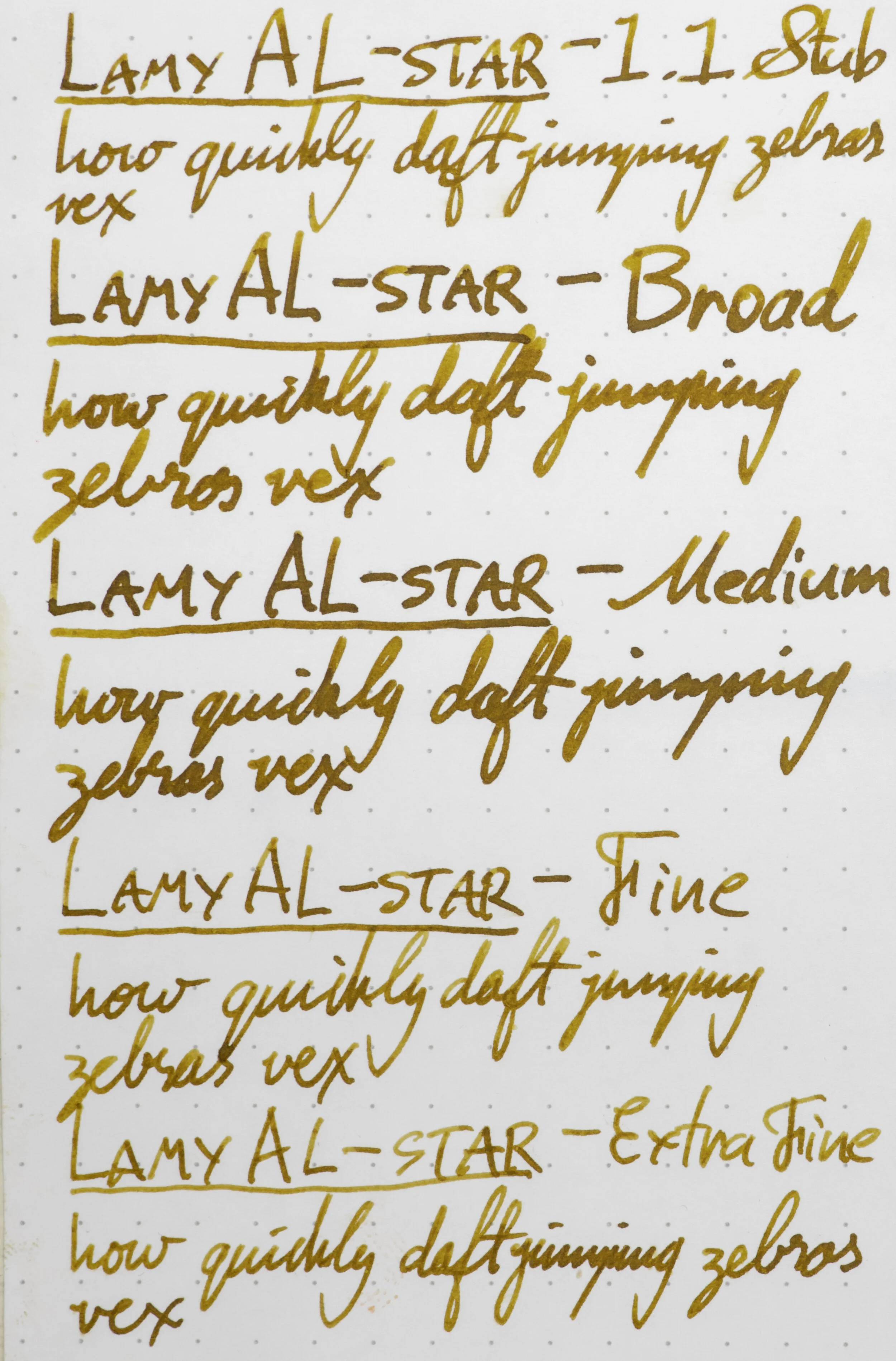
Nib and Pen details
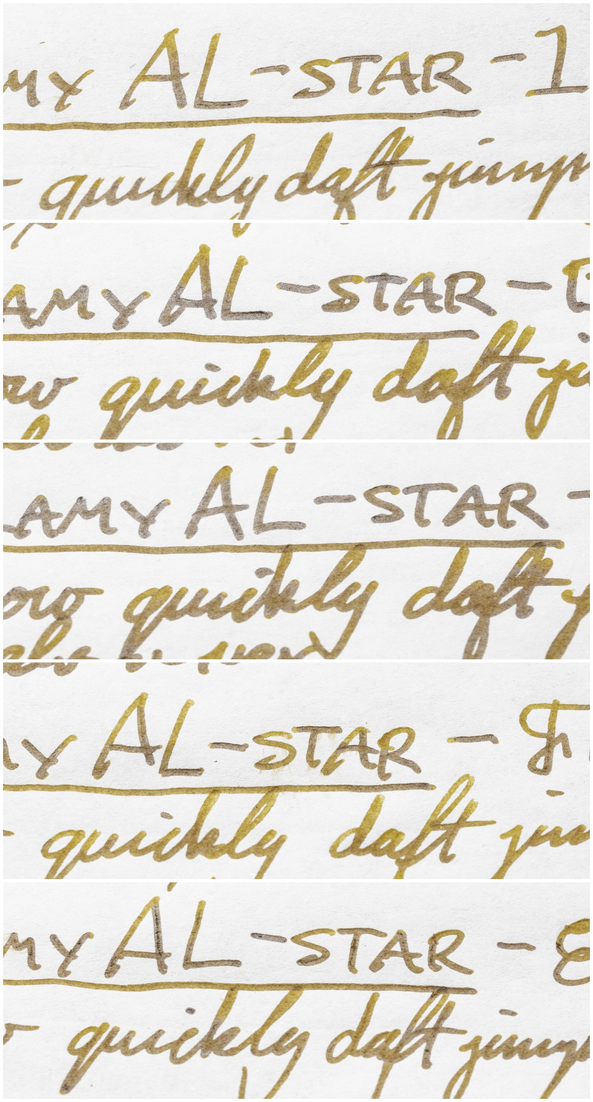
I used a Lamy AL-star Copper Orange pen for this review and six different stainless steel Lamy nibs on that pen. The choice of pen (be that Safari, AL-Star, Vista or Studio) will have little impact in the writing performance. I will not use a Lamy Dialog because there is the rare chance of the nib drying out slightly which might affect the writing performance.
Lamy 1.5 Stub: this nib is moderately wet to write with (this is used for the brand and ink name title);
Lamy 1.1 Stub: this nib is on the drier side;
Lamy Broad: this is a wet;
Lamy Medium: this is a very wet nib;
Lamy Fine: this nib is moderately dry; and
Lamy Extra Fine: this nib is moderately wet.
I also use a fine JoWo nib attached to a James Finniss Serendipity (from Pensive Pens) for the comparison ink names. This nib’s wetness is moderate but the feed is primed which gives it a wetter character than would be a normal writing experience. This generally as the effect of reducing shading and luminosity, while increasing sheen and saturation. The possibility of feathering and bleeding is also slightly increased. This is still more accurate than a dip pen or a glass pen in my experience.
52gsm Ivory (White) Tomoe River
When the ink really pools and takes a while to dry, which is more possible on papers like Tomoe River, the contrast in the swatch gets quite high with the ink becoming a brown-black almost. A similar thing happens with the other KWZ comparison inks.
KWZ Old Gold: is a similar darkness and saturation but too warm with little green tint;
KWZ IG Mandarin: is paler with a stronger green tint;
Robert Oster Marrone Mustard: is fairly similar but darker and a more complicated, almost dichromatic, colour;
Robert Oster Gold Antiqua: is lighter, slightly less saturated and with less of a green tint;
Ishida Bungu Gagome: is more a green brown with hints of blue in the darker parts and is darker overall;
Louis Vuitton Or Audacieux: is lighter and more orange; and
Pilot Iroshizuku Ina-ho: is almost a red-leaning light brown and quite different.
Of these inks I think Robert Oster Gold Antiqua, if you don’t mind a lighter more yellow ink; KWZ Old Gold, if you don’t mind a yellower ink; or KWZ IG Mandarin, if you don’t mind a greener darker ink, are the best alternative options on Tomoe River.

Sheen
The ink has some very decent shading with some strong contrast and decent frequency and a mixture of smooth and sudden gradients. However, this is mostly on the pint writing. On the cursive writing the contrast is much lower and the gradient is almost smooth. There is no haloing.
The sheen of this ink is common for Iron Gall inks and also common for KWZ inks generally. It is a shiny silver sheen. This sheen is present throughout most of the written lines, especially in the darker shaded parts.
Both the KWZ inks have almost identical sheen. The Marrone Mustard Robert Oster ink has a dull matte sheen of sorts that is almost as strong. Louis Vuitton Or Audacieux has a similar, to Marrone Mustard, sheen but much weaker; weaker still is Robert Oster Gold Antiqua. Sailor’s Ishida Bungu Gagome has copper sheen. IroshizukuIna Ho has no sheen on the written line.

Water resistance test many days after lines written
The chromatography has a grey start, most likely the iron gall content, which becomes a yellow gradient that breaks into an orange-brown with a hint of moderately saturated pink at the end; not too bad.
Water resistance is a complicated one because Iron Gall doesn’t become water resistant right away and needs some time to bond to the paper. The above or first water resistance test was done the day the review was written (and, indeed, not long after) but the the drops on the bottom right and left of the photo to the left or second. These drops show considerably more grey lines left behind and these grey lines is how the water resistance of Iron Gall inks manifests itself. Unlike many other water resistant inks, Iron Gall water resistance often means the ink colour will wash away leaving the grey Iron Gall content behind. While this ink is no different it certainly isn’t a strong line left behind, due to the lighter Iron Gall content, no doubt.
Dry time is pretty average from Tomoe River with it being on the slightly quicker side, if anything. There is no smearing.
80gsm White Rhodia
On Rhodia the darker parts of the saturated swatch are not as dark and similarly the darker parts of the wetter inks aren’t as contrasting either.
KWZ Old Gold: is brighter and more orange but has a slight green tint this time;
KWZ IG Mandarin: is a similar darkness but still with too much of a green tint;
Robert Oster Marrone Mustard: is richer and too orange;
Robert Oster Gold Antiqua: is slightly lighter, too saturated, and too orange;
Ishida Bungu Gagome: is mostly just a brown on Rhodia with a hint of green;
Louis Vuitton Or Audacieux: is quite red on Rhodia; and
Pilot Iroshizuku Ina-ho: is less saturated, lighter and quite flat on Rhodia.
For me it is between KWZ Old Gold and KWZ IG Mandarin with the first being the stronger option. It isn’t quite as different a hue on Rhodia as it is on Tomoe River.

Shading is a little weaker on Rhodia with less contrast generally, however the cursive writing has stronger contrast than it did on Tomoe River. There is still some sudden gradients but they aren’t that common with mostly a smooth gradient. There is no haloing on Rhodia either.
The sheen is essentially non-existent on Rhodia.

While KWZ Old Gold shows a hint of sheen on the swatch, only Robert Oster Marrone Mustard shows a decent amount and even then it doesn’t show it on the written line, like all of them don’t.
Water resistance soon after writing is still pretty week but as can be seen from the second image of the water resistance, the bottom right and left corners again show better resistance. This time some of the colour remains as well. This resistance is definitely stronger on Rhodia.
Dry time is on the slightly faster time and there is no smearing.
Conclusion
⭐️ = One Star
★ = Half a Star
☆ = No Star
🚫 = None/Not Applicable
(Star ratings are a rough and glanceable indication and are more quantitative than qualitative. They are not saying that something is ‘good’ or ‘bad’ but rather that, of the particular characteristic, the ink has a ‘high’ or ‘low’ amount)
80gsm White Rhodia
Shading:⭐️⭐️☆☆☆
Sheen:🚫
Shimmer: 🚫
Halo:🚫
Saturation:⭐️⭐️⭐️☆☆
Luminosity: ⭐️⭐️★☆☆
Feathering:🚫
Bleeding:🚫
Flow:⭐️⭐️⭐️⭐️☆
Dry time:⭐️⭐️⭐️☆☆
Smear:🚫
Water Resistance (soon after): ⭐️☆☆☆☆
Water Resistance (a while after): ⭐️⭐️★☆☆
52gsm Ivory (White) Tomoe River
Shading:⭐️⭐️★☆☆
Sheen:⭐️⭐️★☆☆
Shimmer: 🚫
Halo:🚫
Saturation:⭐️⭐️⭐️☆☆
Luminosity: ⭐️⭐️★☆☆
Feathering:🚫
Bleeding:🚫
Flow:⭐️⭐️⭐️⭐️☆
Dry time:⭐️⭐️⭐️☆☆
Smear:🚫
Water Resistance (soon after):★☆☆☆☆
Water Resistance (a while after): ⭐️⭐️☆☆☆
I like darker yellows like this. I generally prefer orange leaning, personally, but this is a good amount of green for an olive-like colour. It has some complexities in a wet with and the shading with a wet pen, when printing and especially on Tomoe River are quite pretty and the ink has some nice silver sheen. It offers some water resistance, though not strong, and the hue-change characteristic of Iron Gall inks but without having to worry about pen cleaning as much as you might do with other Iron Gall inks. I’m a big fan of KWZ inks; they nearly always have excellent performance and they often have some very interesting and unique colours. This is no exception!
Thanks to Bookbinders Design Australia for sending this ink for review, go check them out and see what you like and also follow their socials: Instagram, Facebook, and Pinterest. Use code BBDMACCHIATO for 15% off!
✒︎ ✑ ✒︎ ✑
Thanks for reading! If you have any questions, comments or suggestions please let me know in a via the comments, Instagram, or contact me directly.
You can find my ink collection here and my pen collection here. Is there something you’d like reviewed? Let me know!
For blog updated you can follow @macchiato_man on Twitter, subscribe via email, or like my Facebook page. Check out the sponsors of this blog as well!
I was not compensated for this review and everything here is my own honest opinion. There are no affiliate links in this review. I was sent this ink for the purpose of an honest review.